It’s funny what happens when you take the pressure off a writer or artist. In his off time, Hiroaki Samura, the guy who did Blade of the Immortal, put together a sprawling body of work of painstakingly rendered portraits of what I guess you’d call eroticized violence. Calling it vore or guro doesn’t really do it justice in my eyes because the experience of looking at it was just so alien to anything I’d seen in that category before. If you say guro to me, it’s going to conjure up a mental image of standard commercial manga style illustration of gruesomely violent pornography and what he eventually collected together in The Love of the Brute (Japanese title Hitodenashi No Koi) certainly defies that categorization.
A lot of the imagery and its full implications doesn’t resolve itself easily or immediately, which is the quality that stood out in it the most to me. My eyes would travel across an illustration, taking in the figures and the exquisite rendering, then work out the details, like okay that’s a pole and it’s going in thereand coming out there or I’d realize there were too many hands and feet to all belong to the same person and then a second or third figure emerged. This all took about a second or two to process at most, but the rendering and presentation completely altered how I’d receive the same subject matter depicted by someone working in a more typical style of cartooning.

The most extreme example of that is in porn packaging and the left hand path graphic design wizardry that conspires to draw your eyes to spread legs, thrust out butts, boobs, or whatever else is the intended center of the spectacle. I had to inventory the porn room a few times when I worked at a video store and it was the most cognitive dissonance I’ve ever experienced. I’d be trying to take in the image and just, you know, read off the title, but my attention would be dragged up a leg to a gaping butthole. Again, it’s an extreme example of how design principles are applied to porn, but whether the material appeals to you or not, it’s usually pretty obvious what in specific people are being invited to get off to. I can look at Tom of Finland’s stuff as a lesbian with appetites that don’t really range far outside the conventionally feminine and still very easily see how the sexuality on display is informed by a particular vision of masculine strength and virility.
What kind of confounded me about Samura’s work is that I couldn’t perceive anyone telling me how to look at any of the images. My eyes had a freedom to roam that they had never really experienced in work presented as being explicitly erotic before and it took me a while to really locate that as the real source of the unease and ambiguity I felt the first time I examined it. There’s a considerable lack of emphasis on eroticising specific body parts the way that most porn does, irrespective of intended audience. It’s an element of style recently touched on by Sarah Horrocks in a mock interview she posted to Tumblr, describing her focus on fetishizing the torso as being a manifestation of shame and disassociation and an outlier in a medium that tends to prefer butts. Shame and degradation in and of themselves can be powerfully erotic, and that seems to be what informs The Love of the Brute to the exclusion of all else. When penetration is depicted, it’s purposefully obscured or de-emphasized, dislocating the entire body of work from normative depictions of sex. The implied end result is an examination of those sensibilities on their own merits instead of being ancillary to a given sex act.
There’s probably lots of reasons why Samura’s work in that arena comes off being impassive and lacking explicit focus on the intended erotic target or visible surrogates for the intended gaze, but I kept coming back to how when Brandon Graham first told me about it, he framed it as what Samura got up to in his spare time away from Blade of the Immortal. It feels like there’s ample room for interpreting The Love of the Brute as being detached from the typical framing devices of porn because Samura was an established artist who could shrug off the usual demands of commercialized porn. I mean, really, no one’s forcing Frank Cho or Adam Hughes to draw Yoda as a surrogate for their lecherous gazes in private commissions and sketch covers, so freedom isn’t really going to do much more for a given artist’s work than create a context where they bear the full weight of accountability for the finished product.

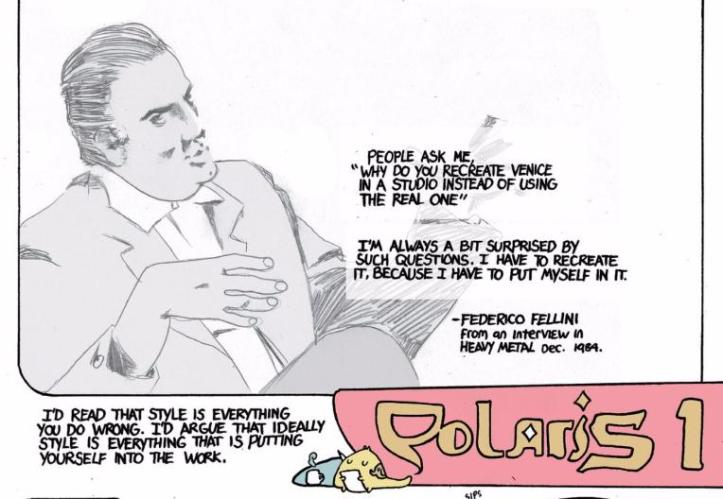
I don’t remember how Samura and what he did in his time away from Blade of the Immortal came up, but it was between the first and second issues of Island, the anthology comic Graham and Emma Rios run out of Image and the intersection of freedom and personal style were clearly at the forefront of his mind. The debut issue opened with a comic depicting God granting Graham freedom to do whatever he wanted, and he chose the creation of the anthology as an experiment before working up to the natural end goal of cannibalism. The issue ended with his meditation on the role of style in storytelling, beginning with a sketch of Federico Fellini with the accompanying quote from an interview with Heavy Metal, “People ask me ‘why do you recreate Venice in a studio instead of using the real one.’ I’ve always been surprised by such questions. I have to recreate it because I have to put myself in it.”

Graham followed it with thoughts of his own, “I’d read that style is everything you do wrong. I’d argue that ideally style is everything that is putting yourself into the work,” and then embarked on a short comic exploring his approach to storytelling and the thought process behind some of the notable quirks of his style like the restless movement of his characters or penchant for moving outside the immediate setting to show incidental interactions. One particular panel always jumps out at me, a throwaway where he mentions thinking about shoujo manga that strives to depict the internal emotions of the characters over the external setting, paired with a drawing of a woman’s face in repose with flower petals drifting past her.
He delivers it flippantly and on the same terms he’d mention any other influence, but what stands out about it is that I don’t think I’ve ever seen that kind of equal footing given to the stylistic choices innovated by the Year 24 Group before. Shoujo manga remains so thoroughly stigmatized in western comics circles that you frequently have to go digging to find discussion of it that doesn’t at least feign some embarrassment and it’s probably the most explicit example of how preferences and prejudices have acted to substantially narrow the scope of what gets recognized within an artist’s style as being an effective or valuable contribution to storytelling.

There’s a lot of different ways to examine what these biases look like in comics, but the most effective way to illustrate it is by examining the reception to three different comics that tell very similar stories with wildly different artistic approaches: Black Widow, Mockingbird, and Black Canary.
The first issue of the current volume of Black Widow, transitioning Mark Waid and Chris Samnee from their work on Daredevil, debuted to thunderous accolades. It holds less than a full point on a scale out of ten over Mockingbird’s debut aggregated over a roughly even number of reviews, but the volume and tenor of praise for Black Widow on social media eclipses Mockingbird’s presence, which is certainly buoyed by name recognition, wider distribution, and more press attention, but the fundamental question is whether or not that’s borne out by what actually appears on the page.
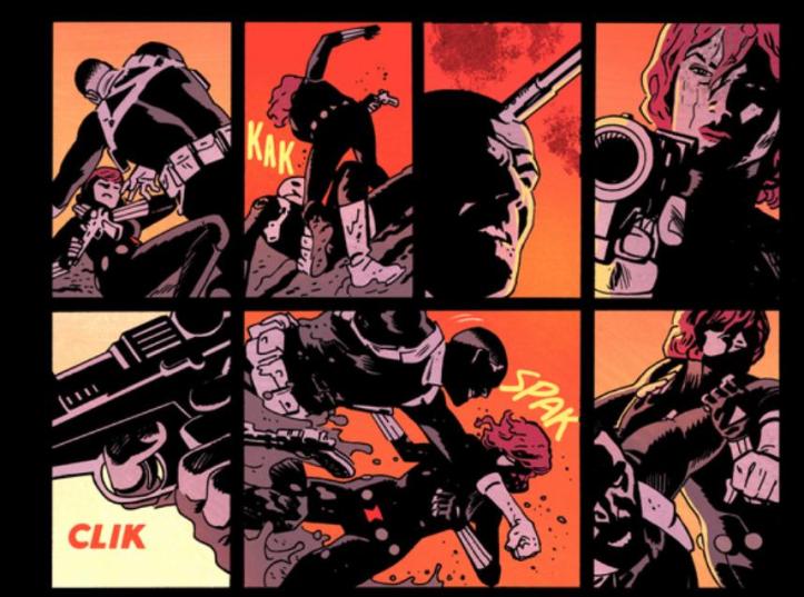
I’m not going to kid myself by pretending that very many people who review comics much weight in their scores to the intricacies of the art, but Black Widow #1 is incredibly underwhelming in what it sets out to achieve and how it uses the page. The entire issue is dedicated to what amounts to the cold open to a Roger Moore era James Bond movie, no more, no less. Which is where style and storytelling come into play. Chris Samnee draws pleasing, kinetic figures that come with a dash of 60s nostalgia, but there’s no ambition exerted to push the page beyond being a rote progression of set pieces. It’s just raw spectacle cobbled together from a madlib of Hollywood action sequences. People fight, they jump out windows, there is a flying car and jet packs, also a motorcycle. The action reads cleanly from panel to panel, but all it adds up to is a recipe for competence.
You look at the hand to hand fight sequence that caps off the issue and it sure is a grid of people hitting each other, but it’s just a collection of static vignettes, there’s no particular flow or evidence of using the size and number of panels to modulate the pacing of the story or offer insight into the story. Natasha is nothing but a body in motion from beginning to end, a blank slate to project a power fantasy onto.

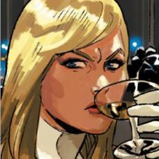
By contrast the fight scenes in Black Canary across all four contributing artists (Annie Wu, Sandy Jarrell, Pia Guerra, and Moritat) work in service to plot and character above all else and consistently find novel ways to lead the eye across the page. Wu frequently works to create an unbroken image in the reader’s mind by drawing on frequently used film shots while Jarrell uses a more conventional approach that relies on the distribution of weight across panels and finding a fixed point to pivot around. Both have produced incredibly unique and kinetic action sequences, Wu most notably in issue #3 and Jarrell in issue #10. With all three examples in hand, it becomes easily apparent what elements of style contribute towards more refined and effective storytelling versus what’s purely cosmetic.

The cosmetic elements of style are a valid and important aspect of any artist’s work, especially in the case of one as talented as Samnee, but the pertinent question is how much that cosmetic element should factor into critique and discussions of greatness. The flip side to a situation where the cosmetic elements of style overwhelm any consideration of effective storytelling is encapsulated pretty well in the muted and more reserved reception to Mockingbird #1. With the previous anecdote about the stylistic flourishes that the Year 24 Group introduced into shoujo manga in mind, it’s not difficult to see how Kate Niemczyk’s vital role in the execution of the story has been largely overlooked.
Niemczyk works in a style heavily inspired by commercial animation easily comparable to Mark Brooks or members of the Udon collective, an aesthetic enhanced by Rachelle Rosenberg’s bright colors and cel shading that has clear parallels with Karl Kerschl, MSASSYK, and Serge LaPointe’s work together on Gotham Academy. There’s a sheen to it that calls up associations that work against it the same way that Matthew Wilson’s desaturated colors and Samnee’s nostalgia inflected figures work in their favor in terms of popular biases. What gets lost in these associations are all the clever and insidious ways that Niemczyk and Rosenberg’s stylistic choices inform the surreality and claustrophobia of the issue.
The limited series, described by its writer Chelsea Cain as a puzzle box, follows its eponymous hero through four weeks of her life as she does missions for SHIELD between visits to one of their medical facilities to monitor the effects of an experimental treatment she’s receiving. The first issue takes place almost exclusively within the medical facility, using the routine of her visits to create a visceral and disconcerting reading experience, the exact opposite of the breezy adventure narrative that radiates through Niemczyk and Rosenberg’s style.
One of the key ways that Cain and Niemczyk build that discomfort in spite of the latter’s pleasing style is the use of repetition. The most apparent way she does it is by slowing down the pacing of the story by grouping small, repeating panels that portray a very short time interval to slow down the reading experience. Dragging out Bobbi’s interactions with the staff to amplify the awkwardness of the interactions and their institutional nature. The other, subtler way is in what stays the same and what changes between visits. Hercules appears in the background of every shot of the lobby, sitting in different chairs, but those establishing shots also shrink as they recur, narrowing the space and contributing to the claustrophobic quality that builds across the issue.
There’s also a very explicit motif of dehumanization built up by combining the repeated use of forms and medical equipment to communicate story. There’s a sense of detachment to reading Bobbi’s report of her activities off a form that gets amplified on the same page as we get tight close ups of the nurse drawing blood from her, collecting a hair sample, and a container with a urine sample without dialogue or her face visible. Eventually it culminates in a page of signifiers of what Bobbi’s experiencing with her completely absent. Just the creeping hands of the zombies she’s been seeing, more charts, more vials of her blood, more containers of urine, and a barking dog.

The net result is an ambitious comic that strives to tell a story far outside of what expectations around the art would imply, and that’s something well worth remarking on. No discussion of how style can subvert or enhance story is complete without mention of Junji Ito’s Cat Diary, a collection of comics about the utterly mundane activities of the writer-artist’s cats rendered in the urgency and dread of his horror comics. There’s something to be said there too for how the entire conceit is the stylistic mismatch in play and how Ito has achieved the status of critical darling on an international scale based largely on praise for how his stylistic choices inform his storytelling. How Ito achieved that status is plainly visible on the page, but like anything else, it’s contingent on critics being willing to interrogate his artwork and draw those qualities out.

Of course Cat Diary, in all of its glory, is the work of a well established creator who has the freedom and pull to produce a personal work completely free of the constraints of more commercially driven work. Much like Samura’s The Love of the Brute, despite the nearly opposite subject matter and execution. Both works offer up opportunities for fresh insights into the creators by lifting their styles out of their usual context, and if you agree with Graham’s perspective, they tell us something about the artists themselves.
Style is an aspect of art in comics that can be difficult to quantify and its impact on storytelling highly subjective, but it informs critical judgements and buying habits like nothing else. How readers, critics, and editors perceive a given artist’s style will either make or break their career and yet, for the most part, the deeply entrenched biases that go into making those judgements are rarely interrogated. Nor do critics routinely interrogate style, particularly the most stigmatized manifestations of it, to uncover the motivations behind them and their considerable impact on storytelling.
Sure, fine, being pressed to deliver a summary judgement on a monthly title under a tight deadline that has to conform to SEO targets and editorial direction can limit the scope of criticism possible within the sphere of mainstream monthly comics. That’s a harsh reality and a mitigating factor, but if you can carve yourself a space outside that hustle, brand new opportunities emerge. It’s funny what happens when you take the pressure off.
