If you can name a single letterer, off the top of your head, I’d recommend skipping this piece.
Still here? Yeah, me too.
A while back, spam alert, I tried making my own mini comic…thing. The goal point was ten pages, a different piece of absurdist political satire in each. I got close in quantity. I think. Quality…well that’s a moot point and that’s entirely down to the lettering. Lettering killed the comic book star. I drew up some speech balloons and text boxes, without that much forgiveness for the text heavy narrative I’d built up. The situation I unwittingly created was akin to watching someone you respect try, insistently, to fit two sleeping bags in one bag. Eventually, technically it fit, but somehow, there was blood everywhere and everyone was crying. The text fit, but the full script was crammed in the balloon – with some letters smaller than the other for no immediately discernible reason, whilst others crammed against the curved speech bubble border. It was brutally inelegant, and thus – rendered questions about the comics quality, redundant. It was hard to read, so most wouldn’t bother finding out. While the “art” wasn’t visually distracting, it wasn’t something you would take much interest in on it’s own. So because I hadn’t planned my lettering out in advance, you couldn’t read the comic and you couldn’t give a shit about the art. So a lack of regard for lettering meant my efforts didn’t culminate in a comic but in a scrap pile of half-done pages, buried in a drawer between pink slips and old pens.
Lettering is story-telling and I couldn’t name a single letterer. I mean, go through the amazing LGNN discussion archives and find a proper lettering discussion. I can’t remember one. Lettering is the elephant in the room of comic book discussion, an essential backbone of the art form and it’s taken for granted. And admittedly, there is good reason for that. It’s writing – do it clean, do it neat and often, that’s all there is. And outside the land of superheroics, most graphic novelists, including the brunt of people discussed in this piece, handle the lettering themselves and they do it well – so there’s little reason to notice or discuss. Why would you actively spark a chat on “I can read this and this is why?” There’s a lot more discussion in how the dialogue is crafted or the art told, those elements naturally sprawl out in a far wider variety of ways – still though, for all the hours I’ve mulled about comics and how they work – I never thought about how lettering works, about what makes it work, it’s function, the tension between visually syncing with the mad worlds it oft inhabits and it’s role as a Mary Sue for the reader to understand what’s going on. There’s a bitter balancing act between aesthetic and accessibility. A challenging choice between a few easy to read words and a block of really good writing.
(Okay, before I get this particular thing on the go, I’d like to be clear. There’s not a comic here I don’t actively love. I have difficulties and issues with many of them to be sure, but I still fucking love them and they’re all ten billion years above the story telling I’ll ever be capable of.)
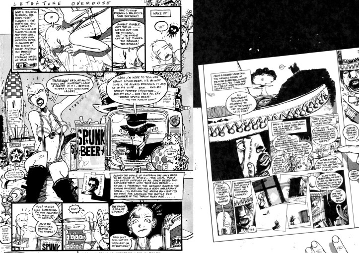
So let’s take Tank Girl, that thing that used to be there until Hewlett made the Gorillaz. It’s awesome and more people should (try) to read it, the Peyote Cornflakes world Hewlett & Martin created is just, simply, really fun to behold. It just also happens to give me brain freeze every time I try to read it. There’s a reason I’ve borrowed it twice and twice racked up fines for something I’ve never properly finished. Tank Girl is exhausting to touch. I wish there was a big arsed Hewlett gallery for me to travel to and love rather than sit and get frazzled at some of the comics. The actual lettering, the chunky claw marks crammed into leaking oval shapes never sticks to its own rules, it’s a cool looking scramble of icons. Readable, sure – but there’s effort and there’s effort to take in the million things going on in a page of TG, to take in the near arbitrary positioning of the text boxes and speech bubbles, makes it difficult to comprehend. With all of that, you can read it, but it takes way more brain power than it should. By the time you reach Hewlett’s perfect jokes, your brain kind of wants to lie down and listen to “Fire came out of the Monkeys head” instead. Gorillaz, the thing that took Tank Girls cultural parking space, has always been full of an uncountable stuffing of imagery in all its frames, much like Tank Girl. But Gorillaz has clean lines, sparse design and most essentially – there’s no text. Just music. You sit back, you watch 2D and Murdoc Niccalls fire machine guns loaded with smaller machine guns at a winged submarine in an ocean of water on fire and it’s all instantly comprehended. It’s accessible where Tank Girl often isn’t. True – that’s the Tank Girl world and it’s a big part of why it took a cultural stead in the first place, but that doesn’t change the fact that for all the brilliant writing and a visual inventiveness that can outshine the hype in Grant Morrison’s own head, you can’t just pick it up and enjoy it. You have to focus, give it time and attention – which is a bit at odds with its anarchic fun ethos. That difference between Gorillaz and Tank Girl comes not simply because there’s no lettering, it’s because there are no text blocks with an inconsistent, esoterically expressive lack of type set and and an approach to lettering layout that can be obscure enough that it may as well be a Voynich Manuscript B-side. Instead of sitting down with Peyote and cornflakes, readers are busy teaching their brain a new language.
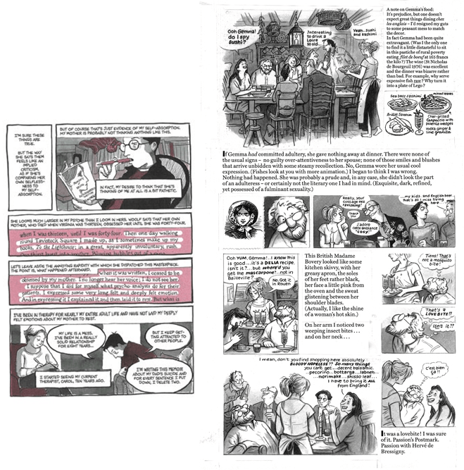
Then you look at Simmonds and Bechdel, artists who might not deal in the vast Bodlean visual library that Tank Girl lives in, but wield vividly detailed imagery against large blocks of novelistic text. Which, after Tank Girl, should logically go down as the literary personification of jogging drunk. But they don’t. Their success as cultural pieces go beyond comic circles and both are as David (in the LGNN interview) refers to as “Guardian bait” comics.
Why? They’re insanely easy to read. You look at them and you immediately accept image and text. It’s easy to read because the lettering is innately familiar. The lettering is clear and consistent, while Simmonds uses a Times New Roman adjacent font to get her Tharg defiant[1] writing across. It’s got a cogent sense of separation between text and image and Simmonds still builds everything on a left to right parallel. Her on page writing could quite possibly surpass the word count on an Alan Moore script and yet, it’s all readable, easily so – because of those hooks of familiarity. A font we know well from computer templates and common cultural ubiquity. The left to right parallel that defines how we read. The visual consistency. It’s familiar, we’ve read this, maybe not this particular combination of letters, but we’ve read this style countless times before – so we can read this. Bechdel does broadly the same. Her ornately detailed illustrations (a demand of the story she chooses to tell in Fun Home and Are You My Mother, her solo cartoons are way looser) keep a consistent sense of separation with the relatively Pychon-esque writing quantity, writing that is clearly hand done, but remains consistent with itself. It remembers left to right as well. So the swathes of text become readable here as well.
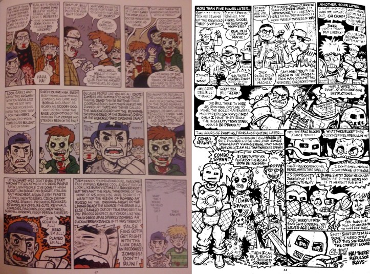
Between Tank Girl and Gemma Bovary, lies Evan Dorkin – who uses the space on his pages the way a native American does buffalo. Dorkin offers a lesson in how to do expressive typefaces well. He hardwires expressive capacity into his lettering. In his The Eltivingville Club comics, their accelerated moral descent is often characterised by certain letters or words taking a more monstrous rendition of the standard lettering, a short hand he uses to emphasise a particular degree of psychosis in the characters statements. Like Tank Girl, his comics are packed to the gills in detail and content, both in text and graphic, but Dorkin is far more accessible. For one thing, by the time he hit his stride with Eltingville, Dorkin had gotten good at text heavy statements that looked good to read, transcending the scrawls of his brilliant Milk & Cheese. There was a specificity to his hand done type set, one that balanced staying with the chaos with clarity really well. There’s a consistency in the scrawl, one that clearly aims to land as close to Comic Sans as possible without ever truly looking polished. It’s basically a font we kind of recognise half way across the train station and because of that, with the text that follows the left to right line on a regular basis, it becomes something easy to read. Even though Dorkin’s lettering is its own weird little thing, it still has enough hooks in fonts and approaches that readers are familiarised with as standard in the medium that we can parse through the claustrophobic detail with ease.
The font itself is the obvious core of how familiar and accessible the lettering of a piece can be. As Simmonds and Bechdel ably demonstrate – consistent, familiar fonts make it easy for people to follow your writing. It’s a big reason why Comic Sans, despite being known in a broader cultural sense as the Tony Blair of fonts, remains a constant throughout the medium. We grew up reading it, for comic readers, it’s the proto-font. We know it so well it doesn’t even register, the narrative information those Comic Sans letters contain go through our brains instantly. Familiarity breeds coherence. And whilst I certainly wouldn’t want to see a Dave McKean piece in Comic Sans, for the bulk of works, it’s far from a wrong answer – it’s known, it’s clear and it’s understandable.
So in about 5 years time, when I’m in jail for setting my fifth orphanage alight, I might get round to attempting another comic. When I do, I like to think I’ve got a better sense of lettering. It’s a balance, between acceding to the visual logic that the artist lends to the world a work inhabits and keeping one foot out of that, as a gateway drug for the reader to slip into. The more auteur a creator chooses to get with the lettering, the greater the onus on them to find ways for it to remain familiar, recognisable and accessible to a readership – without that, it becomes a hassle to read. It’s one thing for the content of the letters, the ideas and themes they poke at to be challenging or esoteric, but it’s a fairly arrogant ask to have difficult handwriting and expect someone to enjoy the process of reading it. It’s like going to a cinema and sitting next to a farting car insurance advert.
That said, after all the above – I still can’t name a single letterer off the top of my head.
[1] 2000AD Guidelines recommend 25-30 words per panel and up to 9 panels in a page. I think. Shut up.
