Probably the biggest upheaval in the way comics are produced over the last 20 years has been in the way they are coloured. Today’s artists still use pencils and inks, but all colouring is now done in Photoshop. The transition happened in the mid-90s – partly spurred on by the new publisher Image. The results jump out whenever you flick through a new X-Men issue, and compare it to something like a reprint of the 80s Claremont run (alternatively, compare the old and new versions of Sandman). I suspect the cheap phonebook-style giant collections of comics classics, published in black and white, are sometimes better than the originals. The full impact of Barry Winsor-Smith’s Conan is definitely clearer in the black and white Savage Sword of Conan volumes, rather than the coloured Chronicles of Conan trades. Colouring back then often obscured rather than accentuated the line art beneath.
An example of how far we’ve come: much of what makes Saga so eye-popping is the use Fiona Staples makes of colour. The book is about how new families learn to raise children, but it’s wrapped around a shiny space opera. Brian K. Vaughan freely admits that his own parochial domestic concerns are being smuggled in under the cover of the amazing things Staples puts together. Her lines stand out because so much of the background is digitally rendered. Rather than having a sense of depth and ‘realism’, the drama is played out in front of a dazzling digital screen, the intensity of the colour making everything feel bigger, weirder, and more exciting.
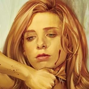
The use of colour as intensifier – often to create a sense of scale and wonder – is quite common for ‘epic’ stories like space opera or high fantasy. The use of colour can be just an ostentatious, but to achieve the opposite effect, in noir. Take Alias – an early Marvel book by Brian Michael Bendis, with art by Michael Gaydos and coloured by Matt Hollingsworth. One of my favourite things about it is the expectations set up by the gorgeous painted covers by David Mack (a disciple of McKean and Sienkiewicz), which emphasise the soulfulness of the main character, and often use purple to hint at her abandoned career as the superhero “Jewel”. Inside, Gaydos’s heavily inked artwork is filled out by Hollingsworth’s ‘muddy’ colour choices, where the shadows look like coffee stains and everything feels dank and miserable. The world Jessica Jones moves through is as far from glossy superhero as it’s possible to get. Noir is a grubby, ugly place.
Project-wide colouring decisions are one thing. More difficult to pick out are the day-to-day decisions the colourist has to make as they approach each page. Often a particular ‘scene’ will have its own tone to distinguish it from the one before, as well as to convey a sense of a different environment. It reminds me a bit of the way photographers have to be conscious of the colour temperature of the light source(s) in their photographs, and make adjustments to render the colours true to life. In a sense, colourists in comics do the opposite, meddling in the colour temperature to accentuate different environments or to achieve shifts in mood or emotion.
One of the most aggressive examples of this I’ve seen is Bite Club, a mini-series about a mafia family of vampires in L.A., written by Howard Chaykin and drawn by David Tischman, with colours by Brian Miller. There, each scene uses shades of a single colour, almost as if a different colour filter has been applied to the lens of the camera. This gives the book a bright, Pop Art feel, suiting perhaps the superficiality of the setting and commercial-mindedness of the characters.
Less brazen than this is the work Jason Howard does in Trees, written by Warren Ellis (in what may turn out to be the finest book of his career). The book cuts between several settings around the world, with different plot strands playing out under the shadows of giant alien “Trees”. One of the ways transitions are marked and a sense of place created is through the use Howard makes of colour. One cool example is a sequence where one character follows another for several pages through different environments, the colours shifting as she enters each one. Howard also uses colour to highlight particular panels. One example is the map panels included when a new setting is introduced, which stand apart from the rest of the ‘action’ in the sequence. Another example is when a character goes through a change of mind or has a new idea – the panel brightens like a lightbulb being switched on.
While some of these effects might not hit the reader in a conscious way (if it does it may mean the colourist has made a bad call!), colour is nonetheless a big component of the overall look and feel of comics. The freedoms created by the digital colouring revolution would suggest that it’s fruitful area for innovation, but there is a danger. As much as I love the sheen of books like Saga, not all stories benefit from the hyper-saturation you can achieve with digital colouring. Choices on colour, as with comics art in general, have to be appropriate to the story that is being told. More books with vibrant colours must be a good thing, but we still need alternative ways to use colour well. The choices of the creative team behind Alias were brave in this respect, and there needs to be room for them.
